(and its use in the classroom)
Colour selection is much more than simply matching the school crest or slapping on a bit of paint on the wall. There’s a science behind it and specifically how it impacts on learning.
When we first launched Learniture, we looked for every opportunity to reduce cost and therefore price. One of the decisions we made to achieve this was to follow the Henry Ford principle of offering “any colour as long as its black” (or in our case, Learniture’s signature Meadow green).
It’s a colour we selected in part because it’s gender-neutral, and in part because of its clear link to nature.
So when we decided to increase our colour offer (we’d already added charcoal grey for those who thought green to be unlucky!) we again looked to nature for our inspiration.
“Nature has a calming effect and cognitive performance improves in naturalistic environments. Our aesthetic preference for naturalistic stimuli is universal: we all respond to nature in the same way.”
Dr Tim Holmes
Neuroscientist
of our evolution
has been spent outdoors
In 2015, Professor Peter Barrett of Salford University published the Clever Classroom report following research that found that “differences in physical classroom design parameters accounts for 16% of the variation in the learning progress of the children in those spaces over a year.”
Colour plays an important role in terms of stimulation which in turn was found to account for around a quarter of the influence the environment has on learning. The study found that a typically calm, neutral backdrop with splashes of colour was the most appropriate design response.
“When viewed as a functional factor impacting on learning, the stimulation from the use of colour was found to be curvilinear, optimally pitched at a mid-level.”
Clever Classrooms report
Barrett et al 2015
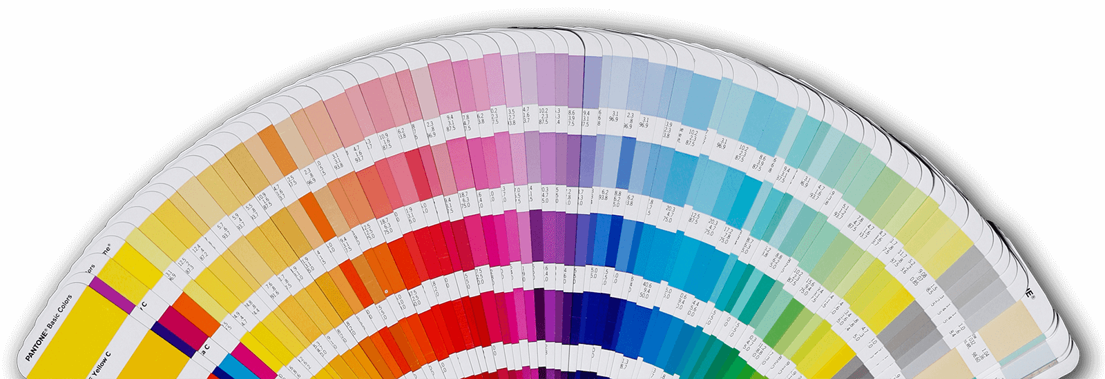
Our colours have been carefully selected so they blend together. For some items (for example the ubiquitous Gratnells tray) we have no control over what colour its offered in but have selected from their standard colours, and as such refer to the colour choices as pallets.
The four colour pallets are as follows:
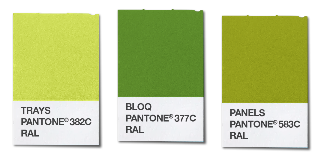
MEADOW
Crisp spring-like greens believed to support collaborative study. The fresh green is said to have a calming effect and is stress reducing.
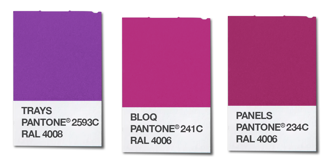
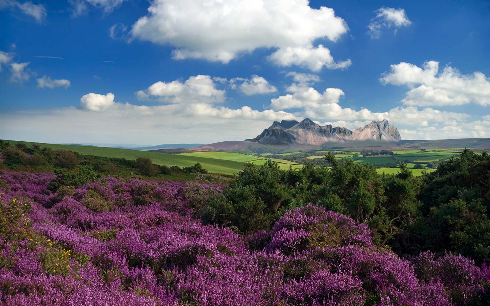
MOORLAND
Warm, muted heathery mauves from the red area of the spectrum and considered appropriate for contemplation. Bright red, on the other hand is found to cause avoidance behaviour (it’s used in warning signs, usually used to denote ‘stop’) whilst also having an arousal affect.
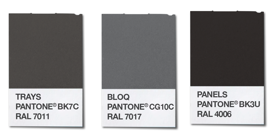
MOUNTAIN
Stylish cool greys and near-blacks creating a clear contrast to any splashes of colour.
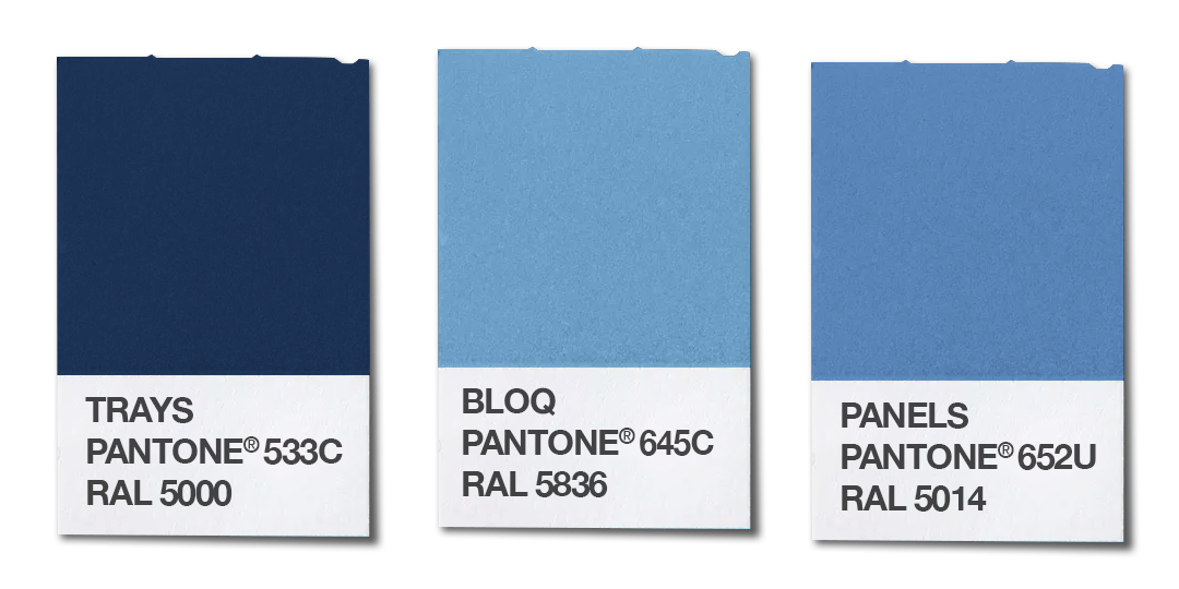
SKY
Clear, calm blues with both light and dark tones and known to support focussed study.
If for some reason it’s imperative that you have a different colour to those we offer as standard, as long as it’s available we can get it for you. However, it may attract a surcharge or a minimum order quantity that’s more than you really want, so it might cost us more. In those instances, we’re sure you’ll understand that we have to reserve the right to pass on those costs to you.